Tunite
Informatics Capstone Project
Tunite
A collaboration platform for social music creation aims to help the up-and-coming artists to gain visibility and build meaningful connections in their community.
Overview
Today’s music market is a super economy. 1% of musicians control 77% of the market. Meanwhile, independent musicians are struggling in the highly saturated space of music. Without resources and social networks reserved for the top, it is extremely hard for indie artists to rise up when they have to rely on word of mouth for recognition with both fans and the community.
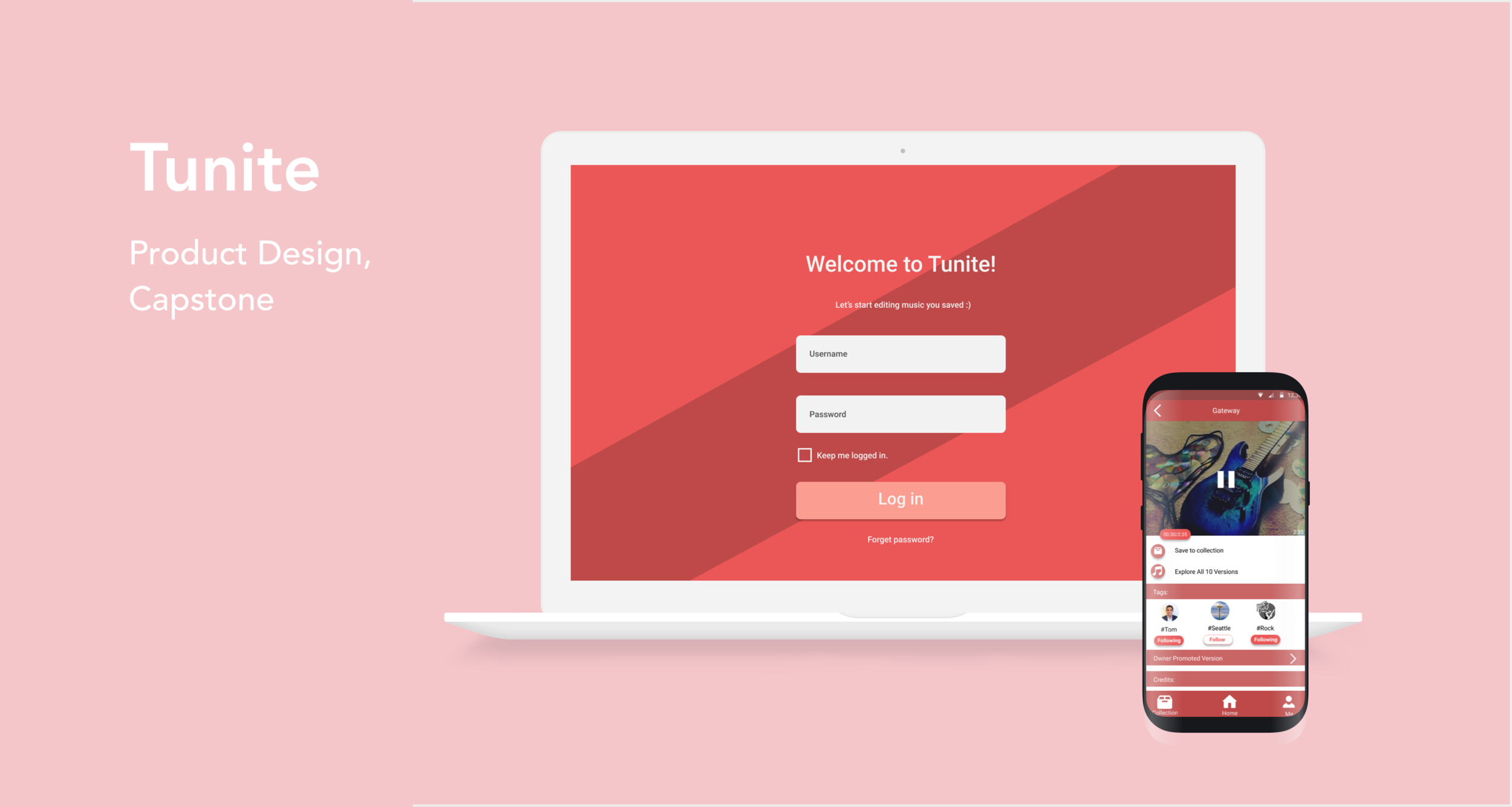
Tunite is a collaboration platform that unites upcoming artists for social music creation. It improves indie artists’ experience in creating and sharing music by making it social and collaborative, so that they can gain recognition and build connections easily, thus breaking into the industry.
Product & Skills
Mobile & Desktop Application Design
User Research
Usability Testing
Information architecture
My Role
As the only product designer on a team of 4, I am responsible for the full design of Tunite. I’m leading all facets of design and user research including user task flows, information architecture, interaction design, visual design, mobile, and web prototyping. I am in charge of conducting user research using methods such as interviews and surveys to address user needs. I also lead usability testing and incorporate user feedback to improve the design in an agile process.
Time Frame
January 2018 – May 2018
This is a Capstone project as part of the University of Washington Information School curriculum. The final products are fully developed mobile and desktop apps built using react native and firebase.
Who are indie artists?
Indie artists are musicians who are not signed with a record label. They typically release self-published CDs and rely on internet promotion to gain popularity.
Many musicians remain independent at the beginning of their music career but later get a record deal and continue as signed musicians.
For our project, we are targeting these upcoming independent artists who are just entering the industry. They have very little connection and are looking to promote themselves with both fans and the community.
Let's jump into the design process.
problem solving process
1. Define the problem
To better understand our target audience’s needs and challenges. We reached out to 14 indie artists to learn about their experiences, troubles, and goals. These artists are working on different genres (hip hop, RnB, rap, EDM, trap), and we kept them as our test users throughout the design.
1.1 Brainstorm & ideation
Before conducting user interviews, our team brainstormed possible solutions. I created sketches and storyboards to conceptualize the ideas we discussed. These sketches were also shown to our interviewees to help us get an initial idea of what they want.
We had the idea of creating a networking app specifically for musicians, where they can create events such as jamming sessions and invite others to participate. Our assumption is that a networking app that encourages musicians to meet in person will allow them to find people with similar music tastes, and can open more doors for collaboration and build connections.
1.2 User research
Through interviews and surveys, we were able to identify 3 main trouble points of upcoming indie artists.
Aspiring artists struggle to find inspiration to come up with an appeal due to a lack of resources and experience. Spending hours on getting inspiration to create an attractive track is almost impossible when they have to worry about maintaining an online appearance.
Even when artists have an idea in mind, finding people with desired skills to produce the track is difficult. Musicians usually have to wait for weeks to find collaborators with the wanted expertise.
Once a song is created and published, upcoming indie artists struggle to increase its discoverability. They rely on word of mouth to promote their music.
We also asked users how they feel about our initial assumptions. They reported that the idea of a networking app for musicians is too similar to existing platforms such as Facebook and Linkedln. Jamming sessions are very limited based on the location of the artists, and you always have the same couple of people attending the sessions. So it is not an effective solution. What they want is something that can really address their pain points.
The challenge
How can we improve upcoming indie artists’ experience with creating and sharing music, so that they can build connections and gain recognition easily, thus breaking into the industry?
1.3 Getting to the root of the problem
Our user research reveals that indie artists encounter a lot of problems in the music creating and sharing process, we know there’s a strong need in this problem space. But what is the root of the problem we should target at?
Our goal is to help indie artists break into the industry. Indie artists lack invisibility because they don’t have the initial fan base. Why can’t they get the initial fan base? Because they struggle to create a song to attract the audience. Why are they struggling to create a song to attract the audience? Because they can’t find suitable, like-minded people to collaborate and make the song. And why can’t they find other talented musicians? Because they don’t have an easy way to get to know other artists and build connections.
2. Market analysis
What are some existing platforms indie artists use, and how do they fall short?
Problem with traditional music streaming platforms (i.e. SoundCloud/Spotify/YouTube):
Traditional music services are focused on the listening experience. We want to create a platform that focuses on creating the experience. For music creators, they miss having the ability to interact with other artists. However, there aren’t any platforms currently succeeding at enabling artists to collaborate freely along with control over their projects.
Our users described how they missed the old days of SoundCloud that was community-based and made meeting other artists easy. Tunite attempts to reintroduce a community-based platform with an emphasis on making collaboration between artists simple - something other mainstream apps fail to do.
Problem with traditional social media platforms (i.e. Facebook, Twitter):
Traditional social media platforms are great platforms for informing fans artists already got, but still has the problem of creating a disconnect from real human interactions that build loyalty.
These platforms don’t support aspiring artists to build their networks without first having something to show for themselves. This is where Tunite enables this type of person.
3. Identify the high-value tasks
Based on the findings from our user interviews and market analysis, we nailed down 2 high-value tasks for the Tunite app.
Explore music inspirations to start a song
Find potential music creators in their community to collaborate and help with completing a piece
With these high-value tasks identified, we were able to think in-depth and design a solution knowing it would for sure address the users’ needs.
4. First iteration - Low fidelity prototype
To help with music collaboration, we integrated the idea of Github with music creation. The first iteration has 2 modes on the app that users can switch between -- the creator mode is for artists who are looking for pieces to collaborate on, and the listener mode is for fans looking to find new music.
Creator Mode
Listener Mode
User feedback
Users loved the idea of uploading a sample of the song and making it open source for others to collaborate on, they thought this is a good way to spark collaborations and draw inspiration from other musicians.
Users mentioned switching back and forth between the listen and create modes is too much work. This created a division between when someone would encore and when someone would save a song for collaboration.
The songs are categorized into different playlists by default, and they need to tap into a playlist to listen to a song. This process is tedious and users want more freedom on exploring all music on the platform.
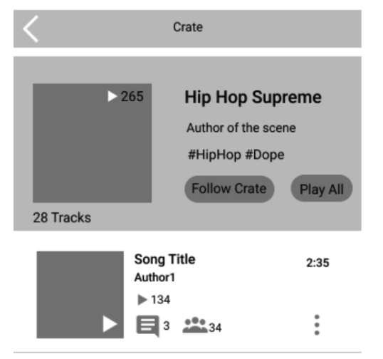
Users were confused by the difference between “crates” and “collection”. The “crates” reminded them of something personal for storage, which is different than what it used for in the app. Originally it was used to describe communities around sub-genres.
5. Second Iteration - High-fidelity prototype
Having create and listen modes introduced complexity when trying to support two unique users. By removing the ability to switch modes, we decided to stick to creation mode in specific. This fixes the problem of division of explore and create songs for artists and allows us to focus on improving the experience for just one user group given the time constraints.
Users want to have an easy way to see the best content, so we introduced “spotlight” as an addition to the encore system to surface the best collaborations. Each week, the most popular collaborations from one original post would become featured as the best collaboration for a song.
We removed the community-driven “crates” and renamed the storage “collection” as “crates” - a personal crate to store music to align with artists’ mentality.
We removed players from the bottom navigation, as artists were more interested in creating rather than listening. This shows emphasis on music creation and blends listening experience naturally into the app design.
User feedback
Users liked the home feed and enjoyed the ability to quickly see the curated music from people and communities they followed.
The first impression of the application was that collaboration was going to be really fun and easy. However, when searching many versions of a single song, users expressed concerns of boredom from listening to a repetitive part of one song over and over.
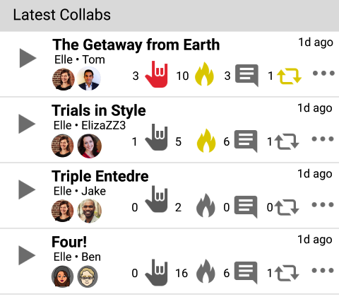
Users found it confusing to distinguish the difference between “encore” and “like”. They are concerned that amateurs would distract from the main intent of an original project by creating popular versions diverging from the first author’s vision. They suggested having the ability to promote a version of a song that they wanted users to collaborate on so that they could have some control in the progress of a developing song.
6. Final iteration
The Encore system was replaced by a more robust way of defining a good song. A two-metrics system - popularity and producer recognition - was established.
Popular songs were based on how many people save a song to the collection to potentially collaborate on it.
Promoted songs were based on the original author interest in deciding what songs should continue collaboration
This method provided a more objective way of rating/ranking songs by taking both groups into account.
A snippet explore system was built for advertising what additions a user made to a song. This allows users to quickly find the version they want to collaborate on.
“Spotlight” and “new music” were removed as they focused on listener popularity and recency as they are included in the new snippet explore system. It also reduced the cognitive load on the user when it came to understanding the vast amount of interconnected features.
The language used for music storage became more intuitive. “Crates” was renamed to “Collection” which was familiar to more users.
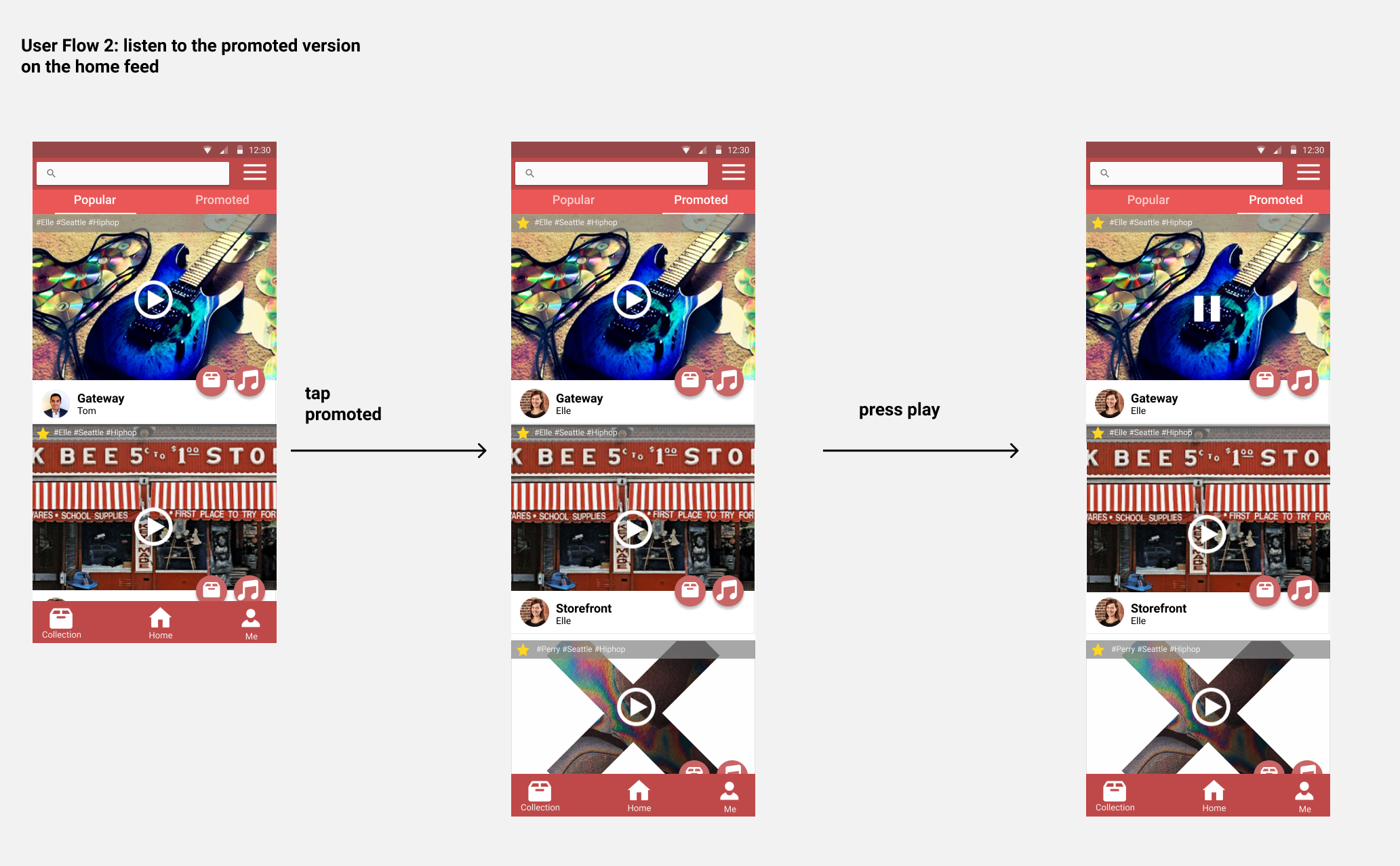
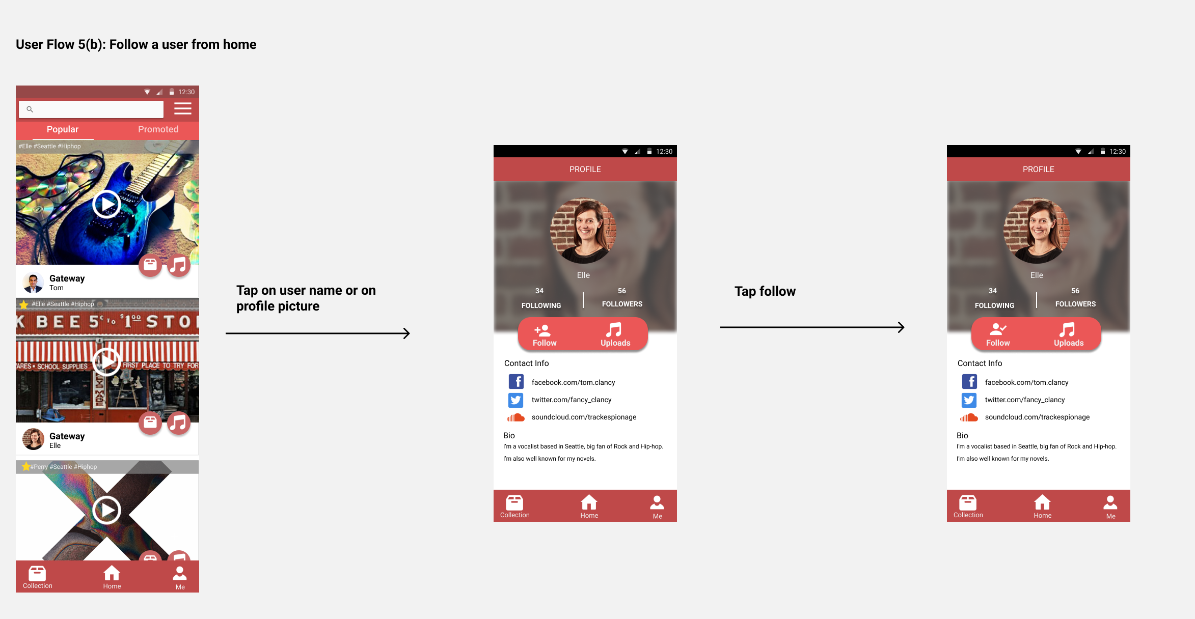
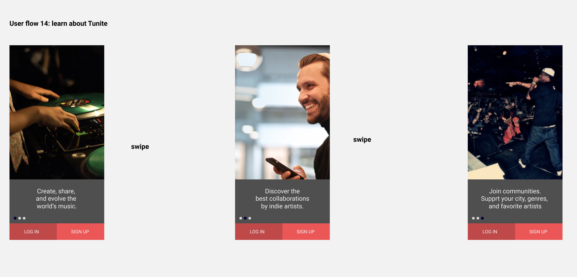
Final User Flow
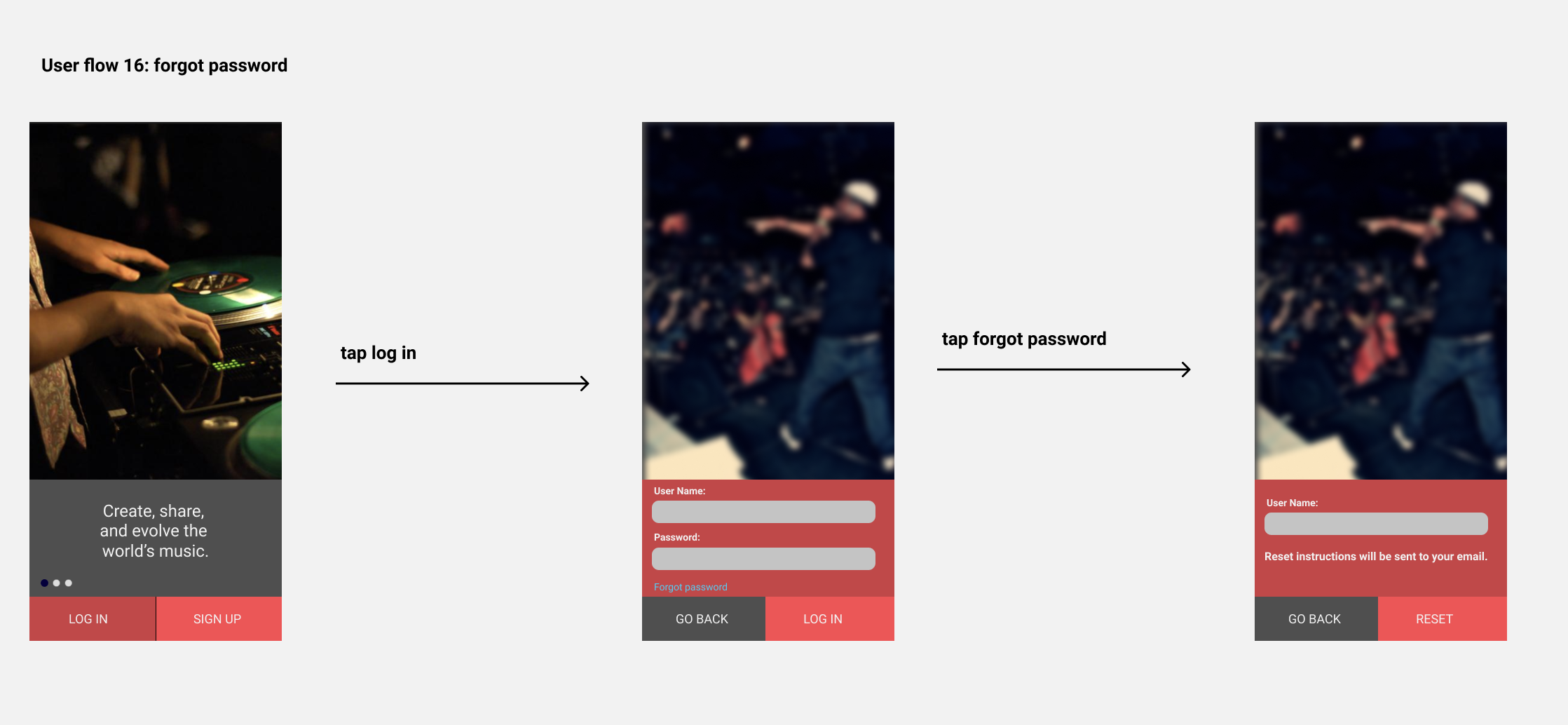
Each user flow is annotated to describe components and features that may not be immediately obvious from viewing a static screen. This helps our developers to understand the design.
Tunite’s final developed app - desktop & mobile
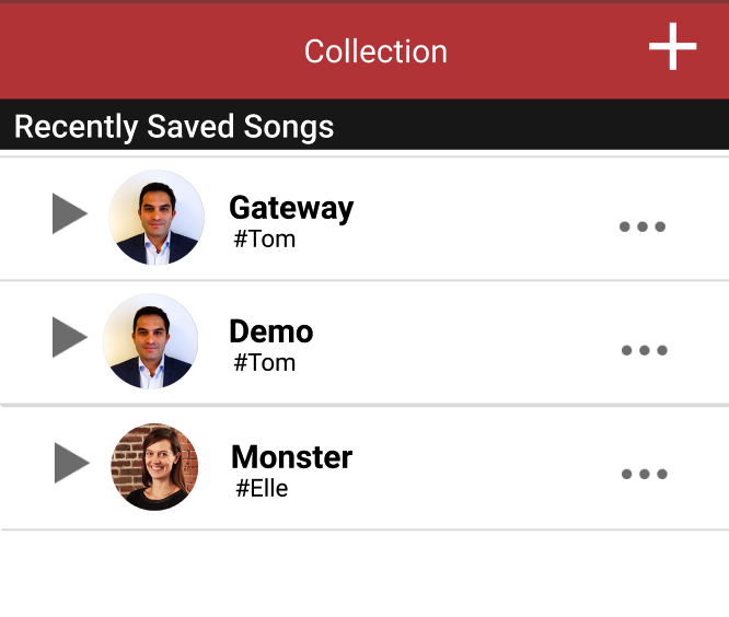
These are screenshots taken from the fully implemented applications based on my final design – they convey my entire design idea and what I learned over the course of the full design process. Here are some of our best screens.
Retrospective & Takeaways
This capstone project was a robust and exciting experience for me to handle all design work independently and communicate with developers to produce a fully implemented application. In a small group of 4, we each work on different roles. We learned how to work on different parts simultaneously to push through the project with limited time and resources. In the end, we created something we’re proud of! (And we got 4.0 for our hard work🎉)
What I learned
This is my first time working alone on design for shipping a product with very little guidance. My ability to make design decisions, improve the design based on feedback, and overcome design constraints are greatly improved. This experience shaped me into a stronger designer capable of all parts of the design process.
The design process helps refine and clarify the problem. Indie artist is a totally unfamiliar user group for the entire team. It is constant iterations with the users that helped me determine the biggest pain points and help them find out exactly what they need. And now, I’m confident to say that I can handle design work from all kinds of problem spaces.
Putting users first is about including them in every step of the design process, especially for marginalized people like aspiring indie artists. Throughout the 3 iterations, every design decision and pivot I made are based on user feedback. This helps ensure the product is addressing an actual user need and has a market. At the capstone fair, hearing comments such as “I wish SoundCloud is like this!” and “Where can I sign up for this?” once again reminded me of the mission of a designer – to create a better experience for the user.
Competitive analysis can be a useful part of user research. Working in a small team of 4, we functioned as a mini startup. I learned to consider the business perspective as I design. This helped provide a unique selling point and assurance that Tunite stands apart from existing music platforms.
What I would do differently next time
Improve on visual design. Due to the development and time limitation, very little time is left for improving the visuals. Having a more consistent design language (color palette, visual hierarchy) will make the app more appealing.
Add features such as message other artists and create playlists for casual listeners. This is an MVP that convey the basic of our envision. If Tunite ever comes to fruition, we should be able to retain users and build a full community that thrives on the platform for business strategies.
The emotional moment as we wrapped up at the capstone fair and say goodbye to our poster😆
- Thank you for reading!


