Snack
Snack
A social media management tool that saves your time by allowing you to snack on the most valuable posts in your social network.
Don't have time to read? Check out the link to the final prototype.
Overview
Young generations have been spending more and more time on social media because of "the fear of missing out", and it has become a big challenge to cut down the time spent on social media. Many people acknowledge the impact social media has on their lives and wish to spend less time on it, but struggles to change their habits with the "endless" posts displayed. Snack is a social media management tool that helps users save time by combining multiple accounts and using an algorithm to display the most relevant posts based on friends and interests of the user. By centralizing and extracting the most important posts, Snack can help users save time and reduce the impact of social media on digital well-being.
Skills
Interaction Design
Prototype Creation
User Research
Content Creation
Tools
Figma
Invision
UserTesting.com
Logistics
March-June 2017
Created in group of 4
I worked as the UX designer and User researcher
Don't have time to read? Check out link to the final prototype.
The Problem
“How can we help young adults save time on social media platforms while still keep them updated with the most relevant posts?”
The Goal
Reduce time spend on social media
Allow easy access across different social media platforms
Display posts that the users find most interesting and important -- aka. a curated digest rather than a general feed!
Problem Solving Process
1. Brainstorming and User Research
With the problem in mind, we started our journey by brainstorming and researching the problem space. Through online research and interviews with people of different age range. We found out that college students are most affected by the use of media platforms and have the strongest intention to reduce time spent on these platforms. So we decided to focus on college students as our primary stakeholder. We determined the audience, concept, and scope of the project.
Audience: College students from age 18 to 22 who have school and possibly work/extracurricular responsibilities.
Concept: A mobile application that combines the most popular social media used by college students, and allows them to capture the most important/valuable posts in no more than a few minutes.
Scope: Make sure the concept is realistic, and create an interactive prototype that fully implements the idea.
2. White-boarding and Persona Creation
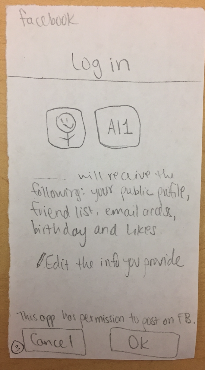
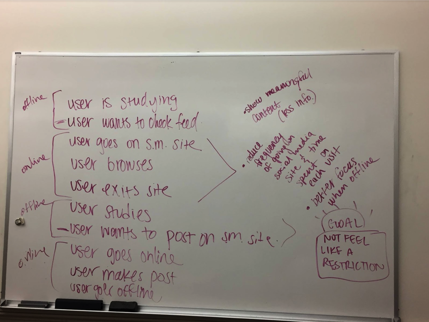
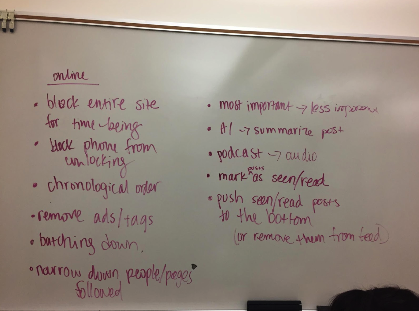
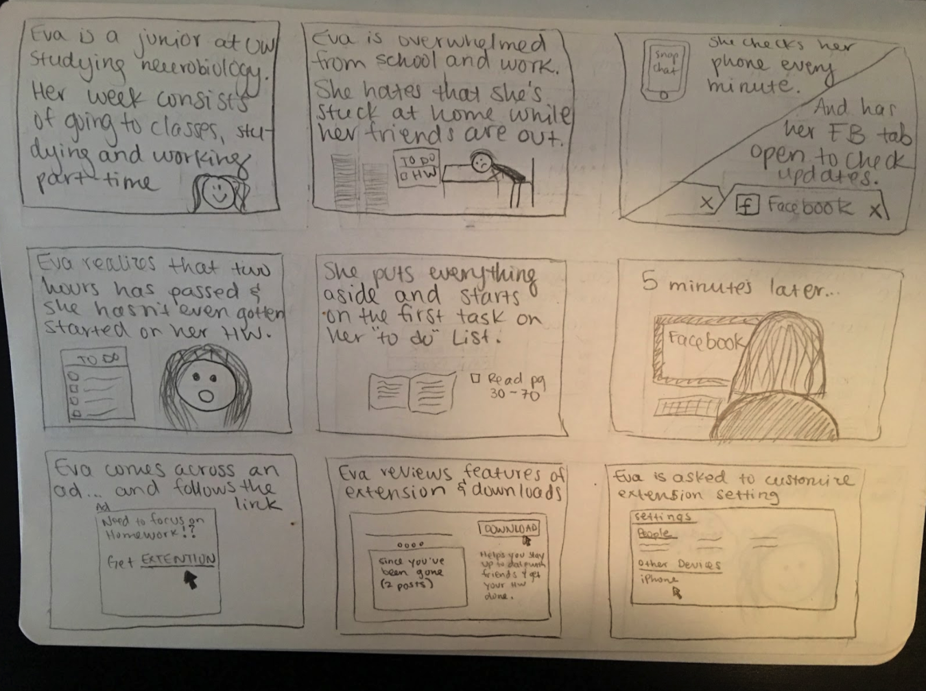
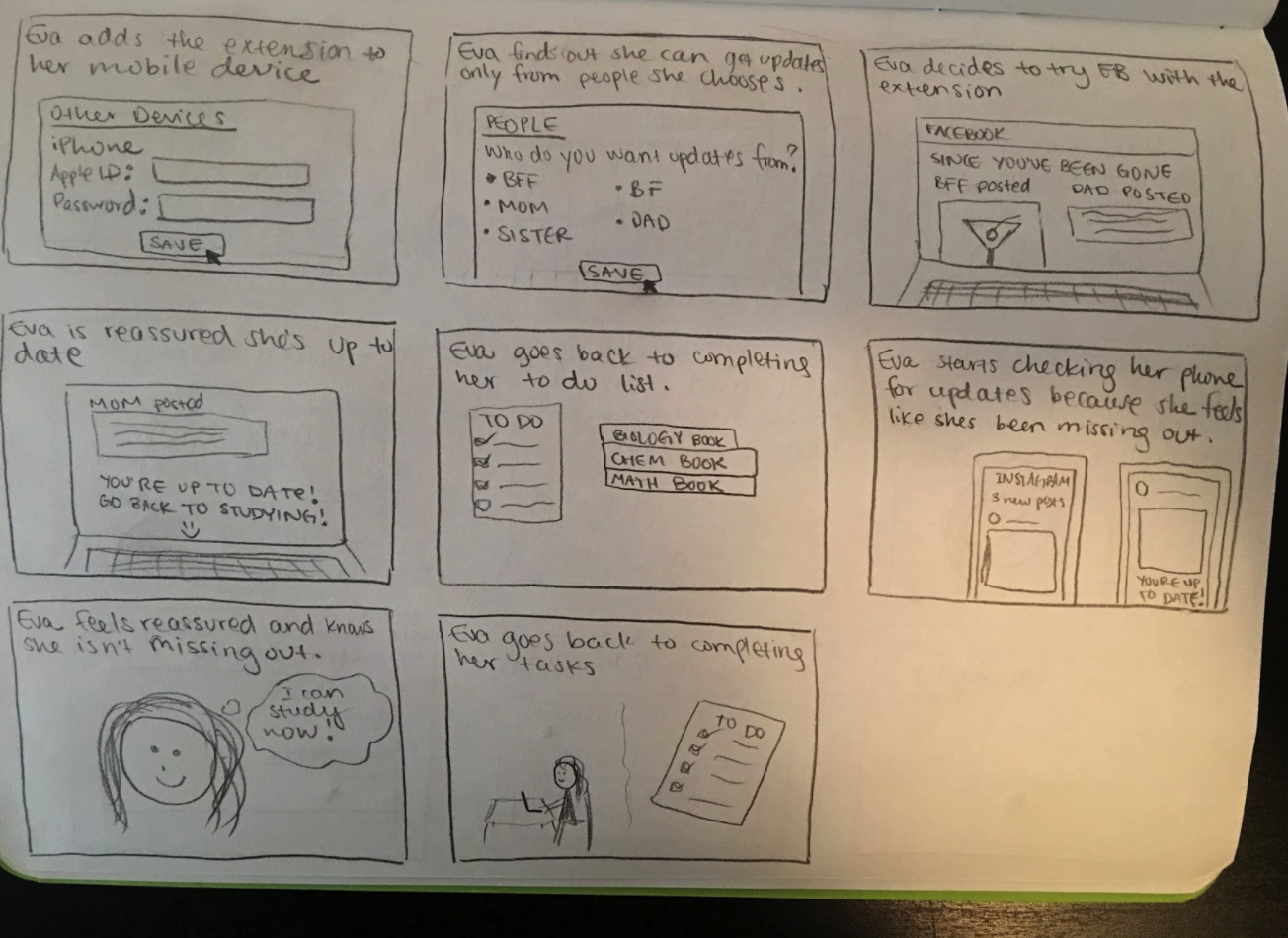
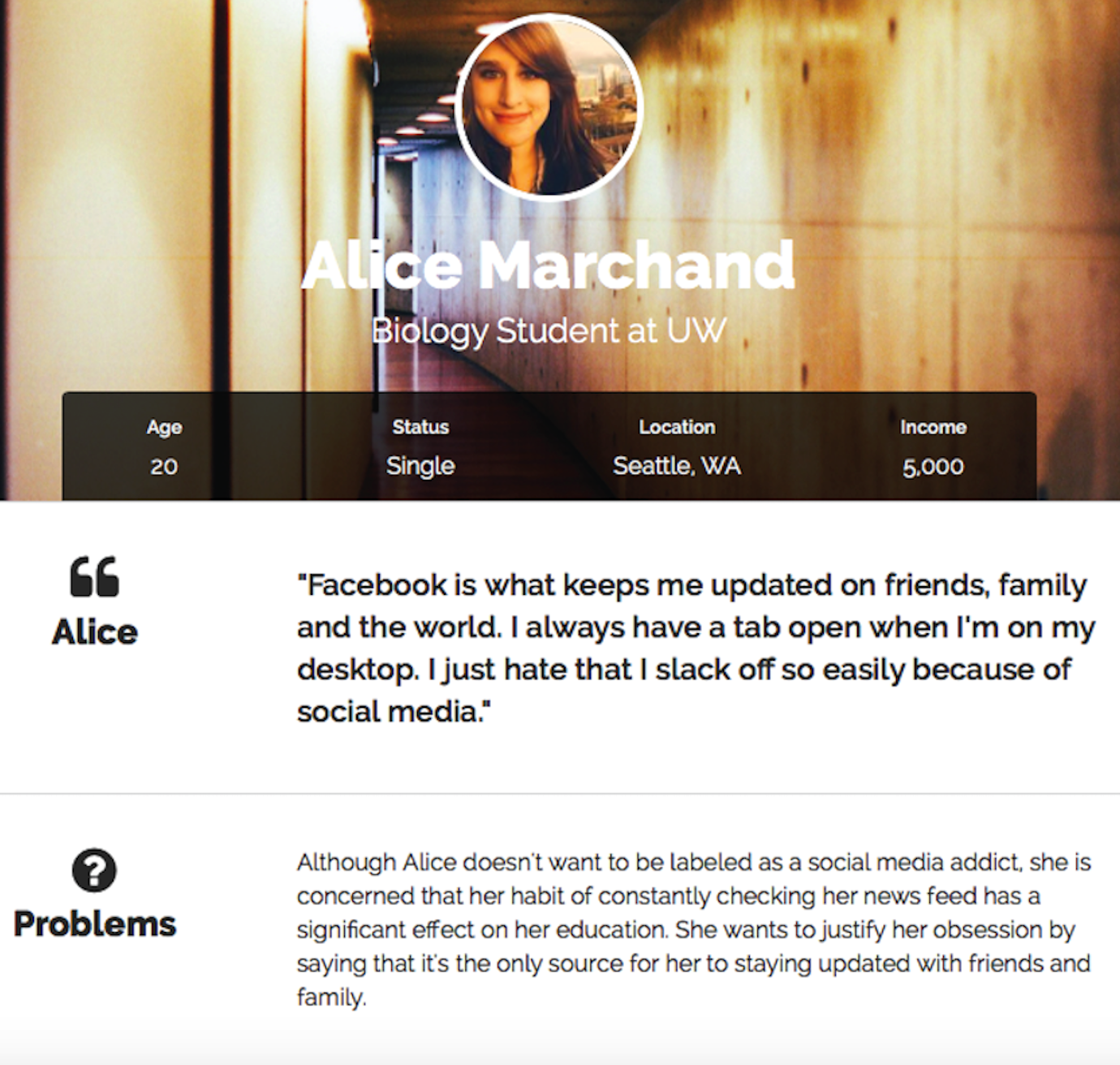
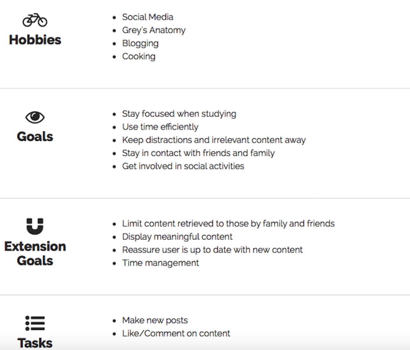
On our first few weekly meetings, we discussed the product vision, outlined important steps that a user could possibly take to interact with our product, and brainstormed possible features. We created a user journey map, a storyboard, and user personas to outline the user behavior and values.
3. Customer survey
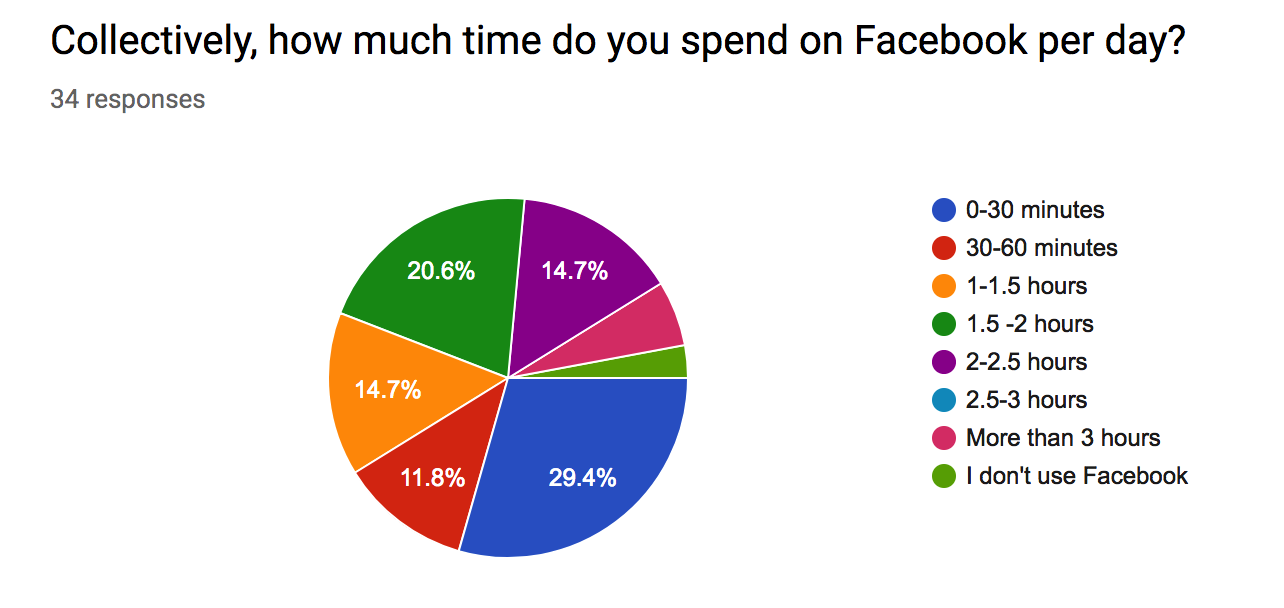
In order to deliver a product that truly solves users' problems, we need to make sure we are making right the assumption about the users. To better understand our audience and their needs, we surveyed 34 individuals. We had 2 hypotheses before collecting the data -- 1. Users spend more time than they would like on social media. 2. Users are not happy with the content they see on social media sites.
Our findings supported the first hypothesis. On average, people spend 1 to 1.5 hours on social media. Currently, around 62% of the users spend more than 30 minutes on social media platforms. However, around 67% of respondents reported they wish to spend less than 30 minutes on these platforms. The data proved that users do spend more time than they would like on social media.
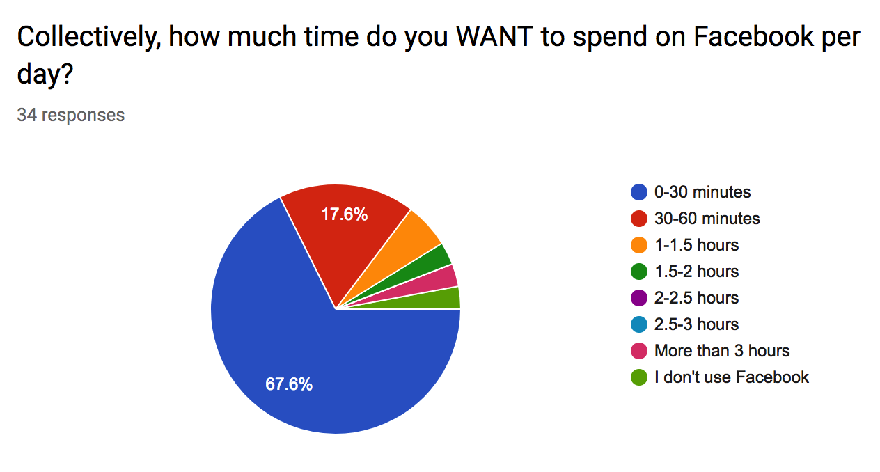
Here is a link to the survey.
However, the data failed to support the second hypothesis. Users reported that they were happy with the content they see on social media. When asked which type of content they most enjoy, a majority (94%) of them answered "posts from close/family". Followed by "topics/pages that interest them".
These findings helped us verify our initial hypothesis and also revealed a big challenge for our project. Our conceptual idea is to ensure that users are not missing out on important content. But, what is important content? Our survey data shows that this differs from user to user, which is why we concluded that it's crucial to create an algorithm that would fully personalize the application. How exactly should we personalize the content? By allowing users to select their preference based on close friends/interested topics to follow.
At this point, we were able to clearly identify the design goals moving forward to the wireframing stage:
Provide a fully personalized experience that allows users to decide the most valuable content on their own.
Limit the amount of content to be displayed in order to cut down on time spent on social media.
4. Wireframing
After analyzing the survey data, we were able to decide the functions for our first wireframes. These functions are:
connect/disconnect social media accounts
favorite friends/topics followed in accounts linked
changing time interval for feed refresh
We first sketched out the wireframes for the onboarding process, then moved forward to create digital wireframes to put together a low fidelity prototype for our first round of user testing.
5. Usability Testing
We conducted usability testing with eight participants selected from people who took our customer survey. The purpose of this user testing is to observe how users interact with the app and identify any confusion before we dive into building a high-fidelity prototype. Some hypotheses that we made prior to the usability testing were:
the app is easy to use
users understand our app's value
our app makes people feel more informed than the original social media
The users found the app very easy to navigate, since "the news feed looks very similar to the conventional social media apps". However, because of the similarity the new feeds between snack and other social media platforms, they did not quite understand the value of our app -- most participants think of Snack as a combination of every feed they receive from all linked accounts, but instead, Snack is a streamlined digest that showcases only the selected most essentials posts based on user's preference. They figured out the "what" but did not understand the "why".
The Why: Snack integrates up to three different social media platforms into one and filters posts based on the users’ favorites and interests. Its value is to act as a social media digest that eliminates needless and irrelevant posts to the user and saves their time.
Because our prototype was low fidelity and was not able to show the actual personalized experience per user, the participants did not feel more informed than conventional social media - they noted that without actual content, they cannot give accurate feedback on whether or not they would use Snack if it were an actual product.
“How can we communicate the value proposition of Snack so that users clearly understand its mental model as a personalized social media digest?”
6. High-fidelity Prototype
Drawing insight from our first usability test, we were able to identify the major issue to tackle (listed above) for our next iteration. In order to better communicate the value proposition of the app, we made several major changes during the onboarding process and made sure our final prototype is as close to the actual news feed as possible. However, we did go through quite a few difficulties to communicate Snack's value proposition to the user without stating it directly. We actively discussed possible solutions and were able to solve these design issues as a team.
7. Final Prototype and Usability Testing
For the final stage, we iterated on our prototype design using the agile approach. We iterated on simplifying the onboarding process, improving the language used to display effective messages, and adding interaction for changing time intervals for digest refresh. In the end, we were able to deliver a seamless user flow by creating realistic content, enhancing the interaction and design of the interface. We were able to achieve our goal and effectively communicated the value to our users.
We also used UserTesting.com to gather the final round of user feedback. We were able to get feedback from 10 participants and put together a highlight reel for their feedback. As a result, users were able to understand the app's value successfully. (yay!)
Reflection and Takeaways
This was one of the most interesting and challenging projects I've worked on. Because Snack is a new way of displaying social media feeds, we are basically introducing a new mental model for users to view posts on social media. So communicating the value of the app is the key to our success. We realized this problem after our first round of usability testing and were able to collaborate as a team on it. I learned so much in the agile iterative design process where we test the current design with users, then incorporating their feedback into the next iteration, then repeat the testing process until we receive certainty in the final usability testing that the issue is resolved.
Because none of us have prior experience designing a product that requires introducing a new mental model, we didn't know if the design decision is effective until we validate our assumption with users. There was a lot of trial and error to test if a certain change of design is effective in solving a specific usability issue raised by the user. This process gave me a solid foundation of learning how to make use of user feedback to solve design problems that I was not familiar with. It was challenging but more so interesting to see different personalities and needs and address those needs through design. Learning about how to design a product that fits different needs and personalities was also a valuable experience. Apart from the fact that we had to use mock content for displaying posts, which made it challenging for users to feel the personalization feature, we had a solid solution for saving users time on social media.
Next Steps...
Although this project has concluded with the course, there is still room for improvement:
The color scheme of the final app can be changed to give the app a more personalized feeling and more aesthetically pleasing.
The "favorite friends" page for selecting posts to prioritize can use grids to make the friends lists more organized.
The main news feed page can use cards layout to separate posts for reducing extra noise and providing better clarity.
-Thank you for reading!


